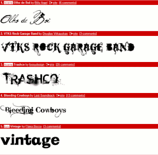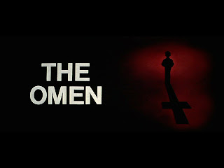
We had to look at possible fonts and sizes for our opening titles. We looked through a number of different styles and sampled many different looks to see what style and font gave the opening titles the best look for our sequence. By researching at what other similar films had we dr
 ew some ideas from there and got our style and font. We looked at the title style of the omen. We then saw how a basic font and style gave a better effect then using a more complex font. Therefore when seeing this we stuck to a basic font style and we drew up and found our title style.
No comments:
Post a Comment